library(GSODR)
library(tidyverse)
library(gifski)
library(gganimate)Visualizing Climate Exposures using Gifs
Introduction
The goal of this document is to present how to use some helpful animation tools within R (the gifski and gganimate packages) for the purposes of visualizing periodic or seasonal time series data as it varies over the course of a standard epoch. This is useful within a number of contexts, for example when working to understand climate-related exposures over the course of the year. These exposures have consistent seasonal patterns which repeat over the course of each year, so we can aggregate over years and subjects/locations to form estimates of expected exposure over time within any desired window. Animation then allows us to examine how this expected exposure differs as the year progresses. We procede with an example based on the Global Surface Summary of Day (GSOD) data through the corresponding API in the GSODR package.
GSOD Data
The GSOD API provides the “get_GSOD()” function which can be used to pull climate information collected by a subset of the GSOD stations. Here, I have selected Station 723400-99999, which is a Weather Service station in Little Rock, Arkansas, near where I grew up. We collect data between 1990-1995, focusing on humidity as indicated by the dew point (labelled “DEWP” in this dataset, measured in degrees Celsius). This choice of outcome was purely motivated by my own past experience enduring the humidity of my home state.
LR_GSOD = get_GSOD(years = 1990:1995, station = "723400-99999") %>%
    mutate(wdate = ymd(YEARMODA)) %>%
    rename(dewpoint = DEWP) %>%
    select(wdate, dewpoint) %>%
    drop_na()
Stationary Visualization of GSOD Data
We can first create a simple visualization of this time series data, using a point plot with smoothing line to understand (seasonal) trends and day-to-day variability after adjusting for these trends.
LR_GSOD %>%
  ggplot(aes(x = wdate, y = dewpoint)) +
  geom_point(alpha = 0.4) +
  geom_smooth(se = F, color = "steelblue", method = "gam",
              formula = y ~ s(x, bs = "cs", k = 35)) +
  theme_bw() +
  labs(x = "Date", y = "Dewpoint (°C)")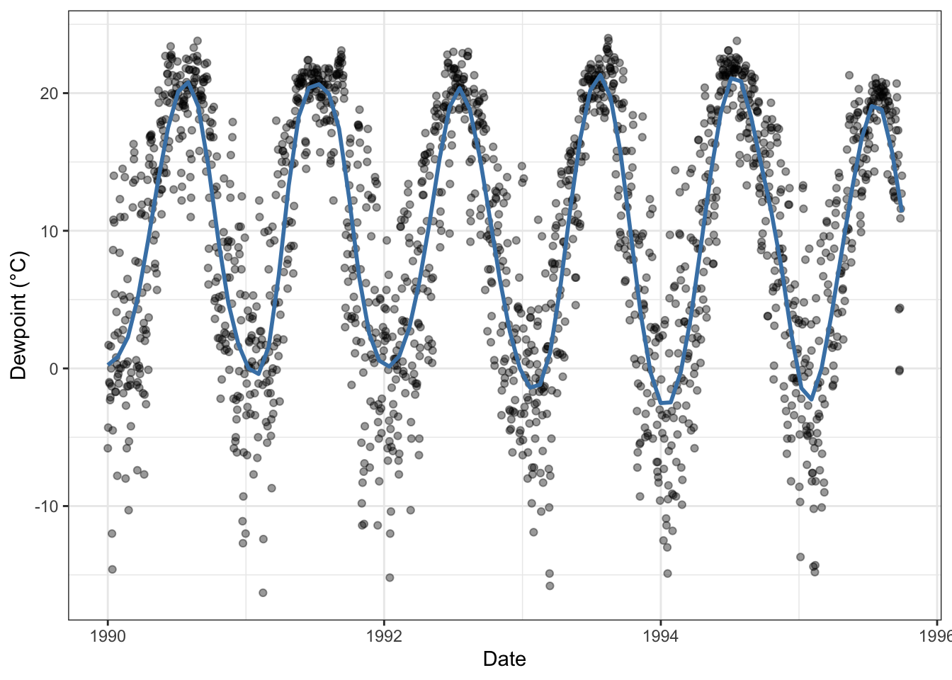
Example Animation
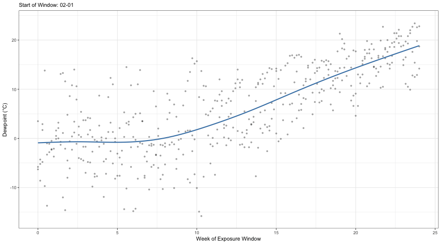
While the above visualization is sufficient for many applications, what about understanding how patterns of dew point over a fixed period, say 6 months, change as one moves through the year? This could be done by sliding a window over the above plot and juxtaposing the visualizations that result from different window locations. However, creating these windowed visualizations and finding the most interesting contrasts can be time consuming.
As an alternative, we can create an animation which demonstrates the evolution of this windowed exposure over the course of the year. Using the gifski and gganimate packages, generating this type of visualization is straightforward. We first expand the data, collecting the appropriate window for each possible start date.
window_length = 6*4 # in weeks

gif_df = LR_GSOD %>%
  group_split(wdate) %>%
  map(function(x){
    sday = first(x$wdate)

    sub_data = LR_GSOD %>%
      mutate(dt = as.numeric(difftime(wdate, sday, units = "weeks"))) %>%
      filter(dt >= 0 & dt <= window_length)

    sub_data$month_start = month(sday)
    sub_data$day_start = mday(sday)

    return(sub_data)
  }) %>%
    list_rbind() %>%
    mutate(day_idx = ymd("1999-12-31") + months(month_start) + days(day_start))

graph1 = gif_df %>%
  ggplot(aes(x = dt, y = dewpoint)) +
  geom_point(alpha = 0.4, size = 3) +
  geom_smooth(se = F, color = "steelblue") +
  theme_bw() +
  labs(x = "Week of Exposure Window", y = "Dewpoint (°C)")

graph1.animation = graph1 +
  transition_time(day_idx) +
  labs(subtitle = "Start of Window: {format(frame_time, '%m-%d')}")

animate(graph1.animation, height = 500, width = 900, duration = 20,
        end_pause = 1, nframes = 200)
anim_save("../resources/images/Gif_Exposure.gif")
We can now view the saved animation through embedding:
While this type of animation is helpful in and of itself, it is best combined with similar animations for related outcome variables and other covariates of interest. Dynamic visualization techniques such as this are an important addition to any statisticians toolkit, and we should not hesitate to leverage them (so long as it is appropriate, of course).